Skip to content
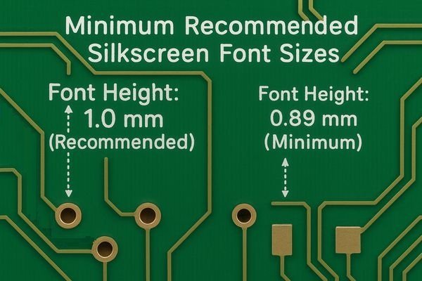
Struggling to read tiny reference designators on a dense PCB? It’s a frustrating experience that slows down debugging and assembly. The solution is to establish clear, readable silkscreen standards from the start.
The minimum recommended silkscreen font height for good readability is 40 mils (\(1.0 \text{ mm}\)), with an absolute minimum of 35 mils (\(0.89 \text{ mm}\)) for non-critical text. For the associated line width (stroke), the minimum is 6 mils (\(0.152 \text{ mm}\)).
Getting silkscreen right is about more than just font size. It's a balance of height, line width, font choice, and even color. These elements work together to ensure that the information on your board is useful, not just decorative. I've seen beautifully complex designs get delayed because the silkscreen was an afterthought, leading to painful debugging sessions with a magnifying glass. Let's break down the key rules to make sure your next board is easy to read and work with.
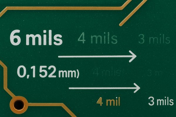
What is the minimum recommended silkscreen line width (stroke width)?
Your font is tall enough, but the characters look blotchy or incomplete. This makes debugging a nightmare, as you try to guess if that's a 'B' or an '8'. The fix is simple: ensure your line width is printable.
The minimum recommended line width, or stroke width, for silkscreen is 6 mils (\(0.152 \text{ mm}\)). While some fabricators can print lines as thin as 4 mils (\(0.1 \text{ mm}\)), pushing this limit risks defects where the text becomes broken or fails to print entirely.
To truly understand why this minimum exists, you need to look at the manufacturing process and the trade-offs involved. It's not just a number; it's a physical limitation defined by the technology used.
Silkscreen Printing Technologies: LPI vs. DLP
There are two primary methods fabricators use, and their capabilities differ significantly. Knowing which method your supplier uses can inform your design choices, especially for prototypes versus production.
| Feature | Liquid Photo-Imageable (LPI) | Direct Legend Print (DLP) |
|---|---|---|
| Process | Ink coated, exposed to UV via mask, chemically developed. | Ink is "jetted" directly onto the board surface. |
| Typical Resolution | Excellent. Min line width of 4-6 mils (\(0.1 - 0.15 \text{ mm}\)). | Good. Min line width of 8-10 mils (\(0.2 - 0.25 \text{ mm}\)). |
| Setup Cost | Higher (requires a film mask for each design). | Lower (no mask required). |
| Ideal Use Case | Production runs, high-density boards, high-reliability. | Quick-turn prototypes, low-volume runs. |
Balancing Reliability and Density in Line Width Selection
While a fab house might list a 4 mil minimum capability for their LPI process, this is often their "hero" number—achievable under perfect conditions but with a lower yield. Pushing the limits increases the risk of defects. For a high-reliability product, sticking to a more conservative width is a smart choice.
| Line Width (mils) | Line Width (mm) | Readability & Risk |
|---|---|---|
| \(< 5 \text{ mils}\) | \(< 0.127 \text{ mm}\) | Very High Risk. Likely to be unprintable or rejected by fab. |
| 5 - 6 mils | \(0.127 - 0.152 \text{ mm}\) | Minimum for most fabs. Use only when necessary. |
| 7 - 8 mils | \(0.178 - 0.203 \text{ mm}\) | Recommended. Robust, clear, and prints reliably. |
| \(> 8 \text{ mils}\) | \(> 0.203 \text{ mm}\) | Excellent. Use when space is not a concern. |
What is a good height-to-width ratio for silkscreen text?
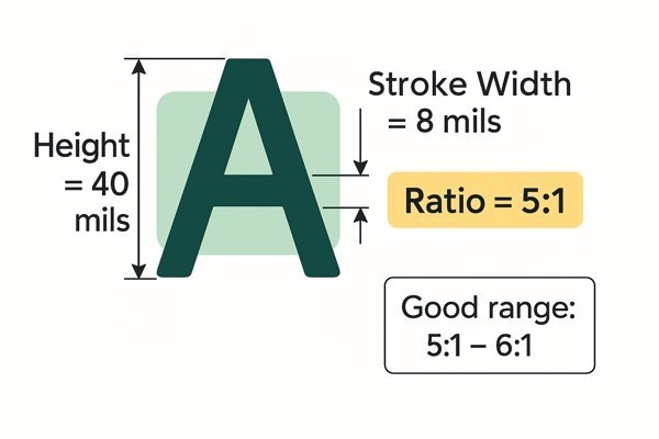
You followed the rules for height and line width, but the text still feels cramped or spindly. This happens when the ratio between the character height and its stroke width is off. The solution is to maintain a balanced aspect ratio.
A widely accepted height-to-width (stroke) ratio for optimal readability is approximately 5:1. For example, a character that is 40 mils tall should have a stroke width of around 8 mils. Ratios between 5:1 and 6:1 provide robust and clear text.
This ratio is a fundamental principle of typography that becomes even more critical when your medium is ink on a circuit board.
The Dangers of Extreme Font Aspect Ratios
The aspect ratio dictates the "boldness" and integrity of a character. A balanced ratio is key to avoiding common manufacturing defects.
| Ratio | Example (40 mil Height) | Appearance | Manufacturing Risk |
|---|---|---|---|
| High (\(> 8:1\)) | 40 mil Height / 4 mil Stroke | Thin, "Spindly" | High risk of broken characters; poor ink adhesion. |
| Optimal (5:1 - 6:1) | 40 mil Height / 8 mil Stroke | Balanced, Clear | Excellent printability and readability. |
| Low (\(< 4:1\)) | 40 mil Height / 12 mil Stroke | Very Bold, "Blobby" | High risk of enclosed areas (in 'A', 'B', '8') filling in. |
How Font Ratios Relate to Gerber File Apertures
To understand this at a deeper level, you have to think about the Gerber file format1. In a Gerber file, stroke-based fonts are "drawn" by a photoplotter using a specific shape, called an aperture. The font's stroke width directly defines the diameter of this circular aperture. This is why the stroke width is such a critical, physical parameter in the manufacturing files.
| Font Height (mils) | Recommended Stroke Width (mils) @ 5:1 Ratio | Typical Use Case |
|---|---|---|
| 35 | 7 | Small, non-critical notes |
| 40 | 8 | Standard Reference Designators |
| 50 | 10 | Clear component labels, test points |
| 60 | 12 | Board names, version numbers, logos |
What are standard silkscreen font sizes in mils and mm?
You're starting a new layout and need to set up your design rules. Instead of guessing font sizes and adjusting later, it's better to start with industry-standard values. This saves time and ensures your board looks professional.
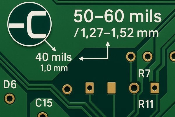
For general-purpose use, a standard reference designator is typically 40 mils (\(1.0 \text{ mm}\)) high with a 6 mil (\(0.15 \text{ mm}\)) stroke. For larger text like board titles, 50-60 mils (\(1.27-1.52 \text{ mm}\)) is common.
Using a few well-chosen text sizes does more than just ensure readability; it brings a professional order to your layout.
Creating a Visual Hierarchy with Font Sizes
A key principle of good design is visual hierarchy. The most important information should be the most prominent. By using different, consistent font sizes, you guide the user's eye.
The Importance of Text Alignment and Placement
Beyond size, consistency in placement is critical for rapid debugging. I make it a rule to place all reference designators in the same relative position for similar components (e.g., always to the top-right of every resistor and capacitor). This creates clean, predictable text flow that makes finding "R57" on a dense board immeasurably faster.
| Element Type | Font Height (mils) | Font Height (mm) | Stroke Width (mils) | Stroke Width (mm) | Notes |
|---|---|---|---|---|---|
| Reference Designators | 40 - 50 | \(1.0 - 1.27\) | 6 - 8 | \(0.15 - 0.20\) | The most common text on a board. Readability is critical. |
| Board Name / Version | 60 - 80 | \(1.52 - 2.03\) | 8 - 12 | \(0.20 - 0.30\) | Should be prominent and easy to find. |
| Pin 1 / Polarity Markers | 30 - 40 (Symbols) | \(0.76 - 1.0\) | 6 - 8 | \(0.15 - 0.20\) | Can be smaller, as it's often a shape (dot, triangle) not text. |
| Informational Text | 35 - 40 | \(0.89 - 1.0\) | 5 - 6 | \(0.12 - 0.15\) | For notes like "Test Point," "GND," etc. Can be slightly smaller. |
Which fonts are best for PCB silkscreen?
You found a stylish font that looks great on your monitor. But when the PCB arrives, it's an unreadable mess because the complex shapes didn't translate well to the ink process. The best practice is to stick with simple, proven fonts designed for manufacturing.
The best fonts are your EDA tool’s default vector font and the OCRA font. If you must use TrueType fonts, simple sans-serif options like Arial are the safest choice because they are designed for clarity and avoid complex shapes that print poorly.

The technical difference between font types is the root cause of most font-related manufacturing problems.
Recommended Sans-Serif Fonts for Silkscreen
If you need to use a TTF font, for branding or other reasons, choose one known for its clarity and simple geometry. Avoid fonts with thin sections or decorative serifs.
| Font Name | Key Characteristics | Best Use Case |
|---|---|---|
| Default Stroke Font | Native to EDA tools; simple vector construction. | The safest, most reliable choice for all general-purpose silkscreen. |
| OCRA | Designed for machine reading; excellent character separation. | High-density boards where misreading 'O'/'0' or 'I'/'1' is a risk. |
| Arial / Helvetica | Widely available, clean, and has uniform line weights. | When a standard, readable TTF font is required for branding. |
| Verdana / Tahoma | Designed for screen clarity; holds up well at small sizes. | For informational blocks of text where readability is paramount. |
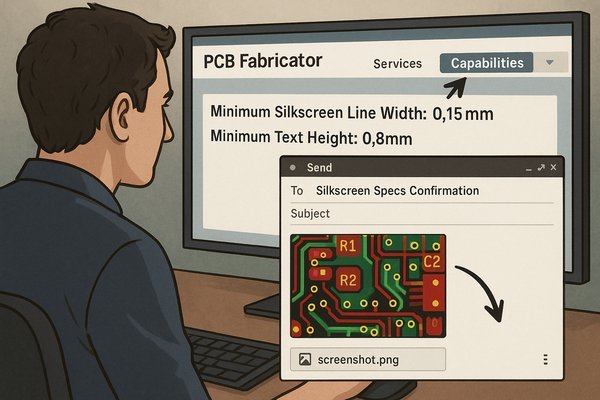
How to check a PCB fabricator's specific silkscreen capabilities?
You've carefully designed your silkscreen, but you're not sure if your chosen manufacturer can actually produce it. Sending files without checking can lead to design holds, unexpected charges, or a poor-quality result. The right way is to verify their capabilities beforehand.
Check the "Capabilities" or "Technical Specifications" page on your fabricator's website for "Minimum Silkscreen Line Width" and "Minimum Text Height." If you cannot find these specific values, email their engineering support with a screenshot of your design for confirmation.
Being proactive here can save you days of delay. Here's a structured approach to ensure your design matches your fab's reality.
Using a Test Coupon to Verify Silkscreen Capabilities
The best way to verify a new manufacturer's true capability is with a test coupon. On the edge of a prototype panel, I add a small area with a battery of tests. This gives me invaluable, real-world data. A good test coupon should include:
- Text Blocks: Fonts at decreasing sizes (e.g., 40/6, 35/5, 30/4, 25/4 mils height/width).
- Line Tests: Parallel lines at decreasing widths and spacings (e.g., 8, 6, 5, 4 mils).
- Resolution Star: A "starburst" pattern of fine lines converging at a center point to visually gauge the finest resolution they can achieve.
- Positive vs. Negative: Include some text in normal silkscreen (positive) and some text created by leaving a void in a solid block of silkscreen (negative).
- Small Logos: Test how well they can resolve any custom graphics.
What does a DFM check for silkscreen look for?
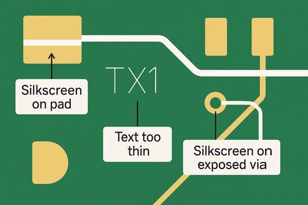
You've submitted your design files, and the fabricator sends back a Design for Manufacturability (DFM) report with a list of silkscreen errors. Understanding what these automated checks look for can help you prevent them in the first place.
A DFM check for silkscreen primarily looks for three violations: silkscreen ink on solder pads (clipping), text or lines that are too thin to print, and silkscreen placed over exposed vias. These checks prevent soldering defects and ensure legibility.
Here is a summary of the most common automated checks your files will go through:
| DFM Check | Common Specification | Reason for Check | Consequence of Failure |
|---|---|---|---|
| Silkscreen-to-Pad Clearance | 4 - 5 mils (\(0.1 - 0.127 \text{ mm}\)) | Prevents ink from contaminating solderable surfaces. | Poor solder joints, open circuits, automatic "clipping" of text. |
| Minimum Feature Size | 5 - 6 mils (\(0.127 - 0.152 \text{ mm}\)) | Ensures lines are wide enough to be printed reliably. | Broken or missing characters, unreadable text. |
| Silkscreen-to-Solder Mask Sliver | 3 - 4 mils (\(0.076 - 0.1 \text{ mm}\)) | Prevents thin, fragile mask slivers from peeling off. | Loose slivers can cause shorts or contaminate the board. |
| Silkscreen over Exposed Vias | Prohibited | Prevents ink from flowing into via barrels or covering test points. | Blocked vias, inability to use vias as test points. |
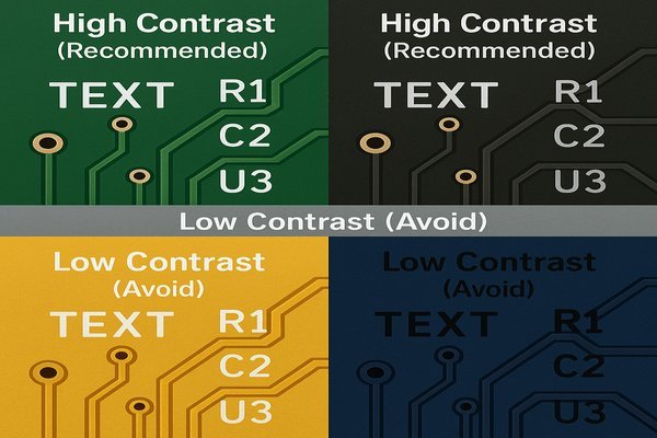
How does the combination of silkscreen color and soldermask color affect readability?
You chose a sleek-looking matte black solder mask for your project. But when the boards arrive, the white silkscreen is hard to read under direct light. The problem isn't the font—it's the lack of contrast and the surface finish.
For maximum readability, use white silkscreen on a green or matte black solder mask. This high-contrast combination is the industry standard for clarity. Avoid low-contrast pairings like white ink on a yellow mask or black ink on a dark blue mask.
Color choice is not just an aesthetic decision; it's a functional one. An unreadable board is a useless board.
How Matte vs. Glossy Solder Mask Finishes Affect Readability
The surface finish of the solder mask plays a huge role. For the PACE photonic computing evaluation board I worked on, we used a matte black solder mask. The white silkscreen on top was incredibly crisp because the matte finish diffuses light and prevents glare. In contrast, a glossy black mask can create harsh reflections under lab lighting, making text unreadable from certain angles.
Considering the Board's Final Environment and Application
Think about where the board will live. A board buried deep inside a machine doesn't need high-contrast silkscreen as much as a board that is frequently serviced. Also, consider thermal properties. A matte black solder mask has a slightly higher thermal emissivity2 than a glossy green or white one. For components that run hot and rely on the PCB for some cooling, this can be a minor but measurable advantage.
| Solder Mask Color | Best Silkscreen Color | Poor Silkscreen Color | Notes |
|---|---|---|---|
| Green | White | Yellow | The industry standard for a reason. Excellent contrast and lowest cost. |
| Red | White | Yellow | Very good contrast, makes boards look distinctive. |
| Blue | White | Yellow, Black | Good contrast, another popular choice for a custom look. |
| Black | White | Yellow (can be okay) | Matte Black is excellent; non-reflective. Glossy Black can cause glare. |
| White | Black | Yellow, White | Black text offers high contrast but can be hard to inspect for trace defects. |
| Yellow | Black | White | Very low contrast. I strongly recommend avoiding white silkscreen on a yellow mask. |
Conclusion
Creating effective silkscreen goes beyond just picking a font size. It's about respecting the physical manufacturing process by using adequate line widths and safe fonts, establishing a clear visual hierarchy with consistent placement, and choosing high-contrast color combinations that ensure readability in the final environment.